Monday 13 September 2021

STATISTICS

Statistics is a mathematical science pertaining to the collection, analysis, interpretation or explanation and presentation of data. It provides tools for predicting and forecasting the economic, marketing, and other activities.

Meaning of Statistics: Statistics is concerned with scientific methods for collecting, organizing, summarizing, presenting, and analyzing data as well as deriving valid conclusions and making reasonable decisions on the basis of this analysis. Statistics is concerned with the systematic collection of numerical data and its interpretation. The word ‘statistic’ is used to refer to 1. Numerical facts, such as the number of people living in particular area. 2. The study of ways of collecting, analyzing and interpreting the facts.

TYPES OF STATISTICS:

1. Descriptive Statistics consists of methods for organizing, displaying, and describing data by using tables, graphs, and summary measures.

2. Inferential Statistics consists of methods that use sample results to help make decisions or predictions about a population. 

DESCRIPTIVE STATISTICS

Descriptive statistics is the term given to the analysis of data that helps describe, show or summarize data in a meaningful way such that, for example, patterns might emerge from the data. Descriptive statistics do not, however, allow us to make conclusions beyond the data we have analyzed or reach conclusions regarding any hypotheses we might have made. They are simply a way to describe our data.

Descriptive statistics are very important because if we simply presented our raw data it would be hard to visualize what the data was showing, especially if there was a lot of it. Descriptive statistics therefore enables us to present the data in a more meaningful way, which allows simpler interpretation of the data. For example, if we had the results of 100 pieces of students' coursework, we may be interested in the overall performance of those students. We would also be interested in the distribution or spread of the marks. Descriptive statistics allow us to do this.

Typically, there are five general types of statistics that are used to describe data: 

A. Frequency table In statistics, a frequency distribution is a list, table or graph that displays the frequency of various outcomes in a sample. Each entry in the table contains the frequency or count of the occurrences of values within a particular group or interval.                                                                                                                                                                   B. Measures of central tendency (Mean, Median & Mode)Measures of central tendency: these are ways of describing the central position of a frequency distribution for a group of data. In this case, the frequency distribution is simply the distribution and pattern of marks scored by the 100 students from the lowest to the highest. We can describe this central position using a number of statistics, including mode, median and mean.             Read more about Measures of Central Tendency by clicking the link Measures of central tendency                                      
                                                                                                                                             
C. Measures of spread or Dispersion:  Variance, Range Measures of spread or Dispersion: these are ways of summarizing a group of data by describing how spread out the scores is. For example, the mean score of our 100 students may be 65 out of 100. However, not all students will have scored 65 marks. Rather, their scores will be spread out. Some will be lower and others higher. Measures of spread help us to summarize how spread out these scores are. To describe this spread, a number of statistics are available to us, including the range, quartiles, absolute deviation, variance and standard deviation.    

When we use descriptive statistics it is useful to summarize our group of data using a combination of tabulated description (i.e., tables), graphical description (i.e., graphs and charts) and statistical commentary (i.e., a discussion of the results).                            

Measures of spread describe how similar or varied the set of observed values are for a particular variable (data item). Measures of spread include:1. Range 2. variance 3. Standard Deviation                                                                                                             Read more about Range, Variance and Standard Deviation by clicking the links:  Range  Mean Deviation    Standard Deviation                                                                                                                                                                                                                         D.  Distribution - Skewness and Kurtosis                                                                         The distribution is a mathematical function that describes the relationship of observations of different heights. A distribution is simply a collection of data, or scores, on a variable. Usually, these scores are arranged in order from smallest to largest and then they can be presented graphically.     
                                                                                        
a. Skewness -  Skewness is a measure of symmetry, or more precisely, the lack of symmetry. A distribution, or data set, is symmetric if it looks the same to the left and right of the center point. Skewness characterizes the degree of asymmetry of a distribution around its mean.  

                                                      The concept of skewness is mainly used to understand the distribution of the data and steps taken to normalize the data for further building of machine learning models.  In case of negatively skewed data, Mean<Median<Mode. This indicates, more data points are to the right of the curve here the data has very high values in large numbers.                                                                                                                                

b. Kurtosis -  Kurtosis characterizes the symmetric distribution through the relative peaks or flatness of the curve. Kurtosis is a measure of whether the data are heavy-tailed or light-tailed relative to a normal distribution.                                                         

The main difference between Skewness and Kurtosis is: Skewness measures the degree of the slope in the frequency distribution. Kurtosis measures the degree of thickness in the tails of the distribution curve.                                                                    

There are 3 types of Kurtosis:                                                                                                   • Platykurtic (relatively flat)                                                                                                     • Mesokurtic (normal)                                                                                                               • Leptokurtic (relatively peaked)     
E. Measures of Position ( Percentile, Quartile )                                                                          What is Percentile? Percentiles indicate the percentage of scores that fall below a particular value. They tell you where a score stands relative to other scores. For example, a person with an IQ of 120 is at the 91st percentile, which indicates that their IQ is higher than 91 percent of other scores.                                                                                                       

Percentiles are a great tool to use when you need to know the relative standing of a value. Where does a value fall within a distribution of values? While the concept behind percentiles is straight forward, there are different mathematical methods for calculating them. In this post, learn about percentiles, special percentiles and their surprisingly flexible uses, and the various procedures for calculating them.                                                                                                                            

 Using Percentiles to Understand a Score or Value Percentiles tell you how a value compares to other values. The general rule is that if value X is at the kth percentile, then X is greater than K% of the values.                                                                                                                                                                                                                                                                     What Is a Quartile? A quartile is a statistical term that describes a division of observations into four defined intervals based on the values of the data and how they compare to the entire set of observations.                                                                                           

 Understanding Quartiles To understand the quartile, it is important to understand the median as a measure of central tendency. The median in statistics is the middle value of a set of numbers. It is the point at which exactly half of the data lies below and above the central value. So, given a set of 13 numbers, the median would be the seventh number. The six numbers preceding this value are the lowest numbers in the data, and the six numbers after the median are the highest numbers in the dataset given. Because the median is not affected by extreme values or outliers in the distribution, it is sometimes preferred to the mean. The median is a robust estimator of location but says nothing about how the data on either side of its value is spread or dispersed. That's where the quartile steps in. The quartile measures the spread of values above and below the mean by dividing the distribution into four groups.                                                                                                                                                                   How Quartiles Work Just like the median divides the data into half so that 50% of the measurement lies below the median and 50% lies above it, the quartile breaks down the data into quarters so that 25% of the measurements are less than the lower quartile, 50% are less than the median, and 75% are less than the upper quartile.                                                         

 A quartile divides data into three points—a lower quartile, median, and upper quartile—to form four groups of the dataset. The lower quartile, or first quartile, is denoted as Q1 and is the middle number that falls between the smallest value of the dataset and the median. The second quartile, Q2, is also the median. The upper or third quartile, denoted as Q3, is the central point that lies between the median and the highest number distribution.                                                                                            Now, we can map out the four groups formed from the quartiles. The first group of values contains the smallest number up to Q1; the second group includes Q1 to the median; the third set is the median to Q3; the fourth category comprises Q3 to the highest data point of the entire set. Each quartile contains 25% of the total observations. Generally, the data is arranged from smallest to largest:                                                                                            1. First quartile: the lowest 25% of numbers                                                                          2. Second quartile: between 25.1% and 50% (up to the median)                                         3. Third quartile: 50.1% to 75% (above the median)                                                             4. Fourth quartile: the highest 25% of numbers                                                                                                                                                                                                                      

  INFERENTIAL STATISTICS                                                                                     Inferential statistics are the statistical procedures that are used to reach conclusions about associations between variables. They differ from descriptive statistics in that they are explicitly designed to test hypotheses.                                                                        

 Inferential statistics is mainly used to derive estimates about a large group (or population) and draw conclusions on the data based on hypotheses testing methods. Inferential statistics makes use of sample data because it is more cost-effective and less tedious than collecting data from an entire population. It allows one to come to reasonable assumptions about the larger population based on a sample’s characteristics. Sampling methods need to be unbiased and random for statistical conclusions and inferences to be validated.   Inferential statistics is strongly associated with the logic of hypothesis testing.                                      

 With inferential statistics, you are trying to reach conclusions that extend beyond the immediate data alone. For instance, we use inferential statistics to try to infer from the sample data what the population might think. 

Or, we use inferential statistics to make judgments of the probability that an observed difference between groups is a dependable one or one that might have happened by chance in this study. Thus, we use inferential statistics to make inferences from our data to more general conditions; we use descriptive statistics simply to describe what’s going on in our data. Inferential statistics are useful in experimental and quasi-experimental research design or in program outcome evaluation. 

Perhaps one of the simplest inferential test is used when you want to compare the average performance of two groups on a single measure to see if there is a difference. You might want to know whether eighth-grade boys and girls differ in math test scores or whether a program group differs on the outcome measure from a control group. Whenever you wish to compare the average performance between two groups you should consider the t-test for differences between groupsMost of the major inferential statistics come from a general family of statistical models known as the General Linear Model. This includes the t-test, Analysis of Variance (ANOVA), Analysis of Covariance (ANCOVA), regression analysis, and many of the multivariate methods like factor analysis, multidimensional scaling, cluster analysis, discriminant function analysis, and so on. Given the importance of the General Linear Model, it’s a good idea for any serious social researcher to become familiar with its workings. The discussion of the General Linear Model here is very elementary and only considers the simplest straight-line model. However, it will get you familiar with the idea of the linear model and help prepare you for the more complex analyses described below. 

Thus, Inferential statistics helps to suggest explanations for a situation or phenomenon. It allows you to draw conclusions based on extrapolations and is in that way fundamentally different from descriptive statistics that merely summarize the data that has actually been measured.     

The most common methodologies in inferential statistics are hypothesis tests, confidence intervals, and regression analysis. Interestingly, these inferential methods can produce similar summary values as descriptive statistics, such as the mean and standard deviation. The following types of inferential statistics are extensively used and relatively easy to interpret: 
1. Pearson Correlation 
2. Regression 
3. T-test 
4. Factor Analysis 
5. Disciminant analysis                                                   

CORRELATION AND LINEAR REGRESSION The most commonly used techniques for investigating the relationship between two quantitative variables are correlation and linear regression.
• Correlation quantifies the strength of the linear relationship between a pair of variables
• Correlation is a single statistic, or data point
• Correlation shows the relationship between the two variables
• Regression expresses the relationship in the form of an equation.
• Regression is the entire equation with all of the data points that are represented with a line.
• Regression allows us to see how one affects the other
It all comes down to correlation and regression, which are statistical analysis measurements used to find connections between two variables, measure the connections, and make predictions. Measuring correlation and regression is commonly used in a variety of industries, and it can also be seen in our daily lives.
For instance, have you ever seen someone driving an expensive car and automatically thought that the driver must be financially successful? Or how about thinking that the further you run on your morning workout, the more weight you’ll lose?
Both of these are examples of real-life correlation and regression, as you’re seeing one variable (a fancy car or a long workout) and then seeing if there is any direct relation to another variable (being wealthy or losing weight). As we investigate the relationships between two variables, it’s important to know the differences and the similarities between correlation and regression.                                                                                       

Correlation vs. regression  - Its not uncommon for correlation and regression to be confused for one another as correlation can often drive into regression. However, there is a key difference.

What is the difference between correlation and regression?
The difference between these two statistical measurements is that correlation measures the degree of a relationship between two variables (and y), whereas regression is how one variable affects another.
Basically, you need to know when to use correlation vs. regression. Use correlation for a quick and simple summary of the direction and strength of the relationship between two or more numeric variables. Use regression when you’re looking to predict, optimize, or explain a number response between the variables (how influences y).                                             

What is correlation? When it comes to correlation, think of it as the combination of the words “co” meaning together and “relation” meaning a connection between two quantities.    In this sense, correlation is when a change to one variable is then followed by a change in another variable, whether it is direct or indirect. Variables are considered “uncorrelated” when a change in one does not affect the other. In short, it measures the relationship between two variables. For example, let’s say our two variables are x and y. The changes between these two variables can be considered positive or negative. A positive change would be when two variables move in the same direction, meaning an increase in one variable result in an increase in another variable. So, if an increase in x increases y, it’s positively correlated. An example of this would be demand and price. This is because an increase in demand causes the corresponding increase in price. The price would increase because there are more consumers who want it are willing to pay more for it. If two variables are moving in opposite directions, like when an increase in one variable results in a decrease in another, this is known as a negative correlation. An example of a negative correlation would be the price and demand for a product because an increase in price (x) results in a decrease in demand (y). Knowing how two variables are correlated allows for predicting trends in the future, as you’ll be able to understand the relationship between the variables — or if there's no relationship at all.                                                                                                      

Correlation analysis The main purpose of correlation, through the lens of correlation analysis, is to allow experimenters to know the association or the absence of a relationship between two variables. When these variables are correlated, you’ll be able to measure the strength of their association. Overall, the objective of correlation analysis is to find the numerical value that shows the relationship between the two variables and how they move together. One key benefit of correlation is that it is a more concise and clear summary of the relationship between the two variables than you’ll find with regression.   

                                                        
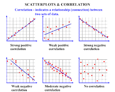
Example of correlation A correlation chart, also known as a scatter diagram, makes it easier to visually see the correlation between two variables. Data in a correlation chart is represented by a single point. In the chart above you can see that correlation plots various points of single data. Let's think of correlation as real-life scenarios. In addition to the price and demand example, let's take a look at correlation from a marketing standpoint to see the strength of a relationship between the two variables. For instance, it could be in your company's best interest to see if there is a predictable relationship between the sale of a product and factors like weather, advertising, and consumer income.                               

What is regression? On the other hand, regression is how one variable affects another, or changes in a variable that trigger changes in another, essentially cause and effect. It implies that the outcome is dependent on one or more variables. For instance, while correlation can be defined as the relationship between two variables, regression is how they affect each other. An example of this would be how an increase in rainfall would then cause various crops to grow, just like a drought would cause crops to wither or not grow at all.
                                                                                                                                  Regression analysis Regression analysis helps to determine the functional relationship between two variables (and y) so that you’re able to estimate the unknown variable to make future projections on events and goals.  

The main objective of regression analysis is to estimate the values of a random variable (z) based on the values of your known (or fixed) variables (and y). Linear regression analysis is considered to be the best fitting line through the data points. Let’s use the example of tracking the value of a single share in the stock market over the years. X will be time in years and Y will be the value in dollars. We know that the value of a stock is changed by time passing, among other things. We can’t control those other things, but we can control when we sell the stock, so we control the time variable. But how dependent is the value of a stock on time passed? If we bought a stock for $1 and in one year its value went up to $100, does that mean every year the value will go up another $100? Does that mean in 25 years it will be valued at $2500? We don’t know. We figure it out by looking at how much the stock earned over several years. That’s fairly simple because we’re only measuring how much we change one thing or one variable. Then we put those measurements on a graph or plot. The dots could be all over the place or scatteredCould we draw a line through the dots that would show a trend? Let’s call that a trendline. Yes, we can certainly try. That line is a simple linear regression trendline through a scatter plot. For e.g. given below if the data of increase in share  price year after year for 20 years. Time (Yrs)   and stock value: 2000 - 1498,  2001 - 1160,  2002 - 1147, 2003 - 848.  
                                             The main advantage in using regression within your analysis is that it provides you with a detailed look of your data (more detailed than correlation alone) and includes an equation that can be used for predicting and optimizing your data in the future. When the line is drawn using regression, we can see two pieces of information: Regression formula A → refers to the y-intercept, the value of y when x = 0 B → refers to the slope, or rise over run               The prediction formula used to see how data could look in the future is: Y = a + b(x)

Differences between correlation and regression

There are some key differences between correlation and regression that are important in understanding the two.

• Regression establishes how x causes y to change, and the results will change if x and y are swapped. With correlation, x and y are variables that can be interchanged and get the same result.

   Correlation is a single statistic, or data point, whereas regression is the entire equation with all of the data points that are represented with a line.                                                                 • Correlation shows the relationship between the two variables, while regression allows us to see how one affects the other.

    • The data shown with regression establishes a cause and effect, when one changes, so does the other, and not always in the same direction. With correlation, the variables move together.

Similarities between correlation and regression

In addition to differences, there are some key similarities between correlation and regression that can help you to better understand your data.                                                                          • Both work to quantify the direction and strength of the relationship between two numeric variables.

      • Any time the correlation is negative, the regression slope (line within the graph) will also be negative.

  • Any time the correlation is positive, the regression slope (line within the graph) will be positive. So much more than just cause and effect

              Even though they’re studied together, it’s clear that there are obvious differences and similarities between correlation and regression. When you’re looking to build a model, an equation, or predict a key response, use regression. If you’re looking to quickly summarize the direction and strength of a relationship, correlation is your best bet.

T-Test

A t-test is a type of inferential statistic used to determine if there is a significant difference between the means of two groups, which may be related in certain features. It is mostly used when the data sets, like the data set recorded as the outcome from flipping a coin 100 times, would follow a normal distribution and may have unknown variances. A t-test is used as a hypothesis testing tool, which allows testing of an assumption applicable to a population.

For example:

              • Compare if the people of one country are taller than people of another one.

              • Compare if the brain of a person is more activated while watching happy movies than sad movies.

This comparison can be analyzed by conducting different statistical analysis, such as t-test


Factor analysis:

Factor analysis is a way to condense the data in many variables into a just a few variables. For this reason, it is also sometimes called “dimension reduction.” You can reduce the “dimensions” of your data into one or more “super-variables.” The most common technique is known as Principal Component Analysis (PCA). Factor analysis is used to uncover the latent structure of a set of variables. It reduces attribute space from a large no. of variables to a smaller no. of factors and as such is a non dependent procedure.

Example. What underlying attitudes lead people to respond to the questions on a political survey as they do? Examining the correlations among the survey items reveals that there is significant overlap among various subgroups of items--questions about taxes tend to correlate with each other, questions about military issues correlate with each other, and so on. With factor analysis, you can investigate the number of underlying factors and, in many cases, identify what the factors represent conceptually. Additionally, you can compute factor scores for each respondent, which can then be used in subsequent analyses. For example, you might build a logistic regression model to predict voting behavior based on factor scores.


Discriminant analysis

Discriminant analysis is a versatile statistical method often used by market researchers to classify observations into two or more groups or categories. In other words, discriminant analysis is used to assign objects to one group among a number of known groups. By performing discriminant analysis, researchers are able to address classification problems in which two or more groups, clusters, or populations are known up front, and one or more new observations are placed into one of the known classifications based on measured characteristics.

Discriminant analysis is also used to investigate how variables contribute to group separation, and to what degree. For this reason, it’s often leveraged to compliment the findings of cluster analysis.

Market researchers are continuously faced with situations in which their goal is to obtain a better understanding of how groups (customers, age cohorts, etc.) or items (brands, ideas, etc.), differ in terms of a set of explanatory or independent variables.

These situations are where discriminant analysis serves as a powerful research and analysis tool.


Ref: Dr. Hanif Lakdawala's AMR Notes

No comments:

Post a Comment